Everything Old is New Again…Just a Line

Stampin-Up-Just-A-Line-Love-and-Friendship-Card-Idea-Shannon-Jaramillo-stampinup-SU

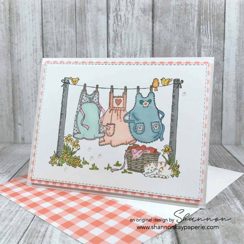
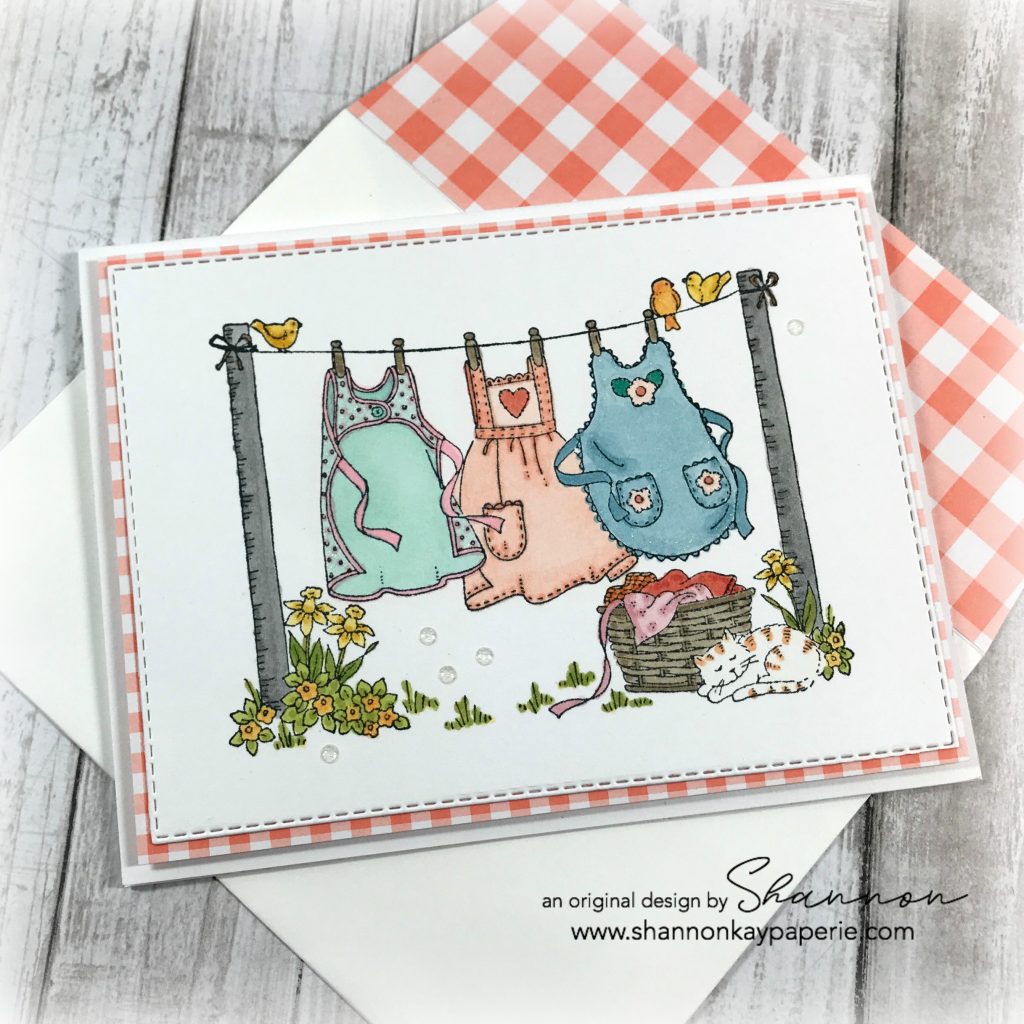
This darling stamp is Stampin’ Up!, circa 1997. Isn’t it sweet? I found this set on-line a few weeks back and had to give it some love…it’s probably been sitting unused for quite awhile 🙁

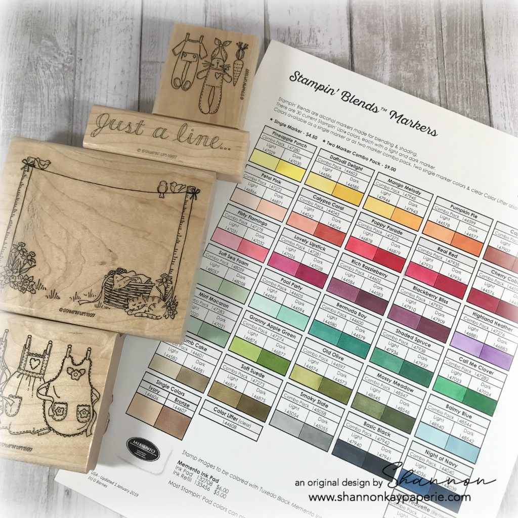
As the stamps are wood mount, I used my Stamp-A-Ma-Jig to stamp two images in Memento Tuxedo Black and then added color with my Stampin’ Blends. Here are a few things that I wanted to share:

  • I had a few choices here. I could have just stamped the clothesline and left it empty, or I could have used the darling baby images at the top of the photo, or I could use the pinafores image (which obviously is what I did). There is also an image of a quilt which I forgot to add to my photo 🙂
  • Isn’t this Stampin’ Blends color chart AMAZING??? Sadly, it is not my creation. It was created by Diane Barnes and you can download a free copy here for yourself, if you would like. I really like seeing all of the colors like this, it makes it SO much easier to choose colors.

Stampin-Up-Just-A-Line-Love-and-Friendship-Card-Ideas-Shannon-Jaramillo-stampinup-SU

  • I also discovered that if you would like to use three colors to shade, you can! Light Calypso Coral is a wonderful darker shade for Light and Dark Petal Pink, and Light Bermuda Bay works well with Light and Dark Pool Party!
  • I used Light and Dark Daffodil Delight to color the daffodils and to color two of the birdies, and used Light and Dark Mango Melody for the third birdie.
  • I also discovered that coloring leaves with Daffodil Delight (quite by accident, I assure you) and then covering it with Granny Apple Green makes a unique shade of green! I then used Light Old Olive as an accent color for the leaves of the low flowers. The leaves of the daffodils were colored with both Light and Dark Old Olive.

Stampin-Up-Just-A-Line-Love-and-Friendship-Cards-Idea-Shannon-Jaramillo-stampinup-SU

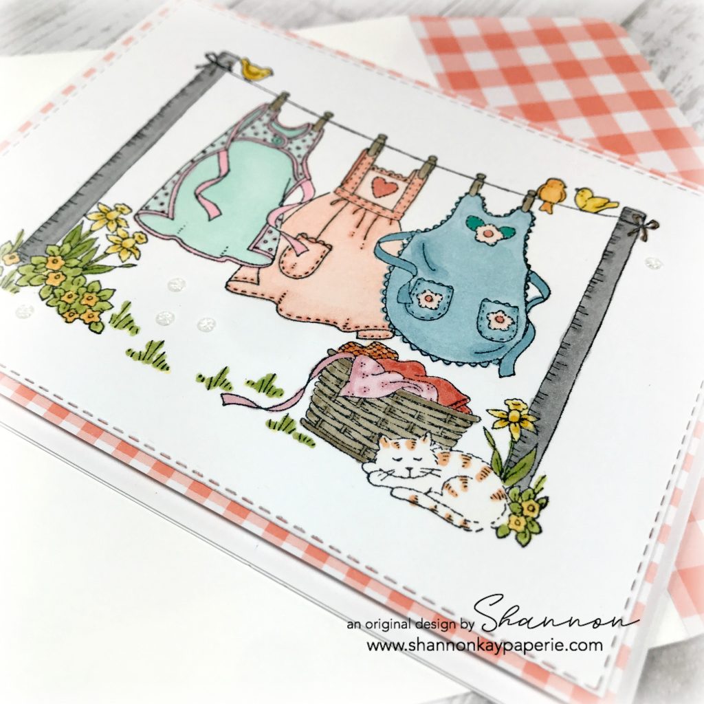
  • The pinafores were colored (left to right) with Pool Park and Flirty Flamingo; Petal Pink; and Balmy Blue.
  • The laundry poles are Smoky Slate because I decided they were metal poles, and the laundry in the basket is Pirouette Pink; Pumpkin Pie; and Calypso Coral. The basket itself is Crumb Cake.
  • Mr. Kitty is colored after my own Buster…white with Light Pumpkin Pie stripes 🙂
  • I used the Rectangle Dies to trim my stamped panel out and then backed it with Grapefruit Grove Gingham Gala DSP. It’s funny to me that the Grapefruit Grove really compliments the Petal Pink pinafore nicely, when it isn’t even a color the I used!! I have no idea….

Stampin-Up-Just-A-Line-Love-and-Friendship-Cards-Ideas-Shannon-Jaramillo-stampinup-SU

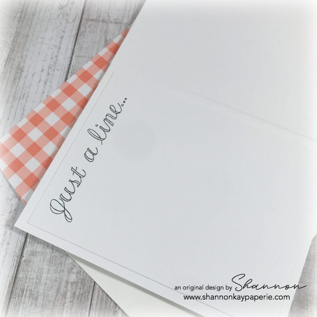
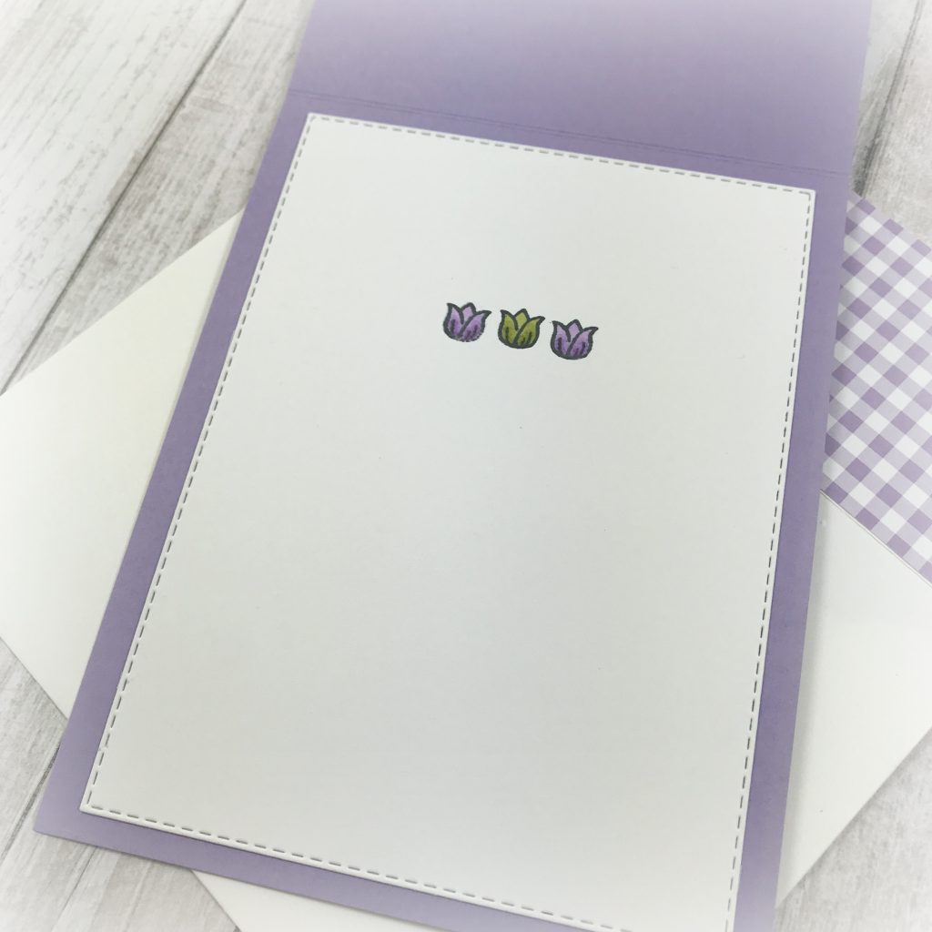
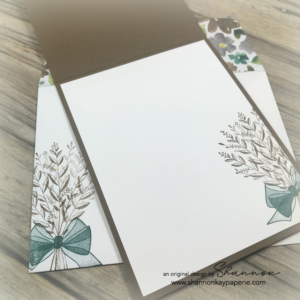
  • This cute little sentiment was a sweet addition to the inside of the card while still leaving ample room for a personal note.

I hope you liked my card today! Please let me know if this set is new to you, or if you have it and my post was a walk down memory lane…  I love that Stampin’ Up! stamps never really go away, they just keep changing hands!

Blessings to you!

Vibrant Vases in Highland Heather

Stampin-Up-Vibrant-Vases-All-Occasion-Card-Ideas-Shannon-Jaramillo-stampinup-SU

Hello Friends and Happy Hump Day to You!! I whipped up this little card last night after having let the color combination sit on my craft table for almost a week! When moving into a new house or redecorating a room, I like to tell my husband that I have to let the walls “talk” to me before I can hang anything up. Do you do that too? It’s the same with this color combination, it had to percolate a little!

Measurements:

  • Highland Heather Card Base 4 1/4″ x 11″ scored at 5 1/2″
  • Balmy Blue Stitched Layer 3 3/4″ x 5 1/8″
  • Gray Granite Stitched Layer 3 3/8″ x 4 3/4″
  • Gingham Gala Stitched Circle Layer 2 7/8″
  • Stamped White Card Stock 2 1/4″ x 3 1/2″

Details:

  • I knew when I sat down to create that I wanted to use the new Vibrant Vases stamp set and the Gingham Gala 6″ x 6″ DSP, both of which are in the new Occasions Catalog and are available now. And purple was a foregone conclusion as it is my favorite color. I don’t decorate with it or wear it, but when choosing plants or flowers, I always seem to pick purple!! Definitely a child of the 80’s and influenced by Prince, lol
  • I stamped the vase and flower posy in Tuxedo Black Memento Ink because I knew I wanted to color it in with Stampin’ Blends. I used both Light and Dark Highland Heather to color and shade the flowers, then Light and Dark Old Olive for the leaves, and then I added Light and Dark Balmy Blue to the mix for the vase. Note: This set does have coordinated stamps to color the flower and vase outline, I just wanted to play with my markers 🙂

  • I used my Gorgeous Grape Stampin’ Write Marker to add a bit of detail to the flower centers, as well as a bit of Wink of Stella.
  • I’m really enjoying playing with all of Stampin’ Up’s stitched dies, they add such a nice touch, but this card can easily be made without them (I’ve provided the measurements above) and would still look beautiful.
  • I just played around with the colors and layers to come up with my layout and couldn’t decide if I should use Balmy Blue or Highland Heather ribbon, so…used both!! These adorable ribbons are available as a free gift with any $50 purchase. The Organdy Ribbon Combo Pack includes 5 spools of ribbon: Balmy Blue, Daffodil Delight, Grapefruit Grove, Highland Heather and Lemon Lime Twist.
  • Retired Old Olive Glittery Enamel Dots add a nice detail (love them) and after sleeping overnight, I came back in and added the Old Olive Banner die cut with a banner die from the just retired Farmhouse Framelits Dies. I trimmed the banner in half and then trimmed quite a bit off to leave just a bit peeking out.

Stampin-Up-Vibrant-Vases-All-Occasion-Cards-Idea-Shannon-Jaramillo-stampinup-SU

  • The interior is quite simple today, just a trio of Mary’s tulips to brighten it up!

For those who don’t “know” who “Mary” is, she is Mary Fish, my Stampin’ Up! up-line, mentor, and friend. For reaching the $1,000,000 sales goal, she was invited to participate and influence the creation of a stamp set, which is Varied Vases in the Annual Catalog.  It coordinates with the Vase Builder Punch as well as this new set from the Occasions Catalog, Vibrant Vases. The tulip is her signature logo so I can never see one without thinking of her 🙂

Thank you so much for stopping by, I hope you’ve enjoyed seeing a prelude to Spring with my card today!

Blessings to You!

Supplies (all Stampin’ Up! unless otherwise noted):

Card Stock: Balmy Blue, Gray Granite, Highland Heather and Old Olive; and Stamper’s Select White by Papertrey Ink

DSP: Gingham Gala 6″ x 6″

Ink: Tuxedo Black Memento

Stamps: Vibrant Vases

Dies: Stitched Shapes Framelits Dies, Rectangle Stitched Framelits Dies; Farmhouse Framelits Dies (retired)

Tools: Big Shot; Stampin’ Blends; Gorgeous Grape Stampin’ Write Marker

Embellishments: Organdy Ribbon Combo Pack (SAB Freebie); Glitter Enamel Dots (retired); Wink of Stella

Other: Whisper White Envelope

Thoughts and Prayers

Stampin-Up-Wish-You-Well-Sympathy-Card-Idea-Shannon-Jaramillo-stampinup-SU

“Inspiration is some mysterious blessing which happens when the wheels are turning smoothly” -Quentin Blake

Measurements:

  • Soft Suede Card Base 4 1/4″ x 11″ scored at 5 1/2″
  • Tranquil Tide Layer 4″ x 5/14″
  • DSP Layer 3 3/4″ x 5″
  • Smaller Tranquil Tide Layer 2 3/4″ x 4 1/4″
  • Stamped White Card Stock 2 1/2″ x 4″

Details:

  • I loved the card I shared yesterday and decided to  use the same concept on another card, this time with a bit of me in the design 🙂
  • I used Soft Suede and Tranquil Tide to compliment this GORGEOUS paper.
  • I added a layer of card stock underneath the DSP as I felt the two layers showcased the gorgeous DSP more fully. (There’s that word again :))

Stampin-Up-Wish-You-Well-Sympathy-Card-Ideas-Shannon-Jaramillo-stampinup-SU

  • I popped the stamped panel up on Stampin’ Dimensionals and added some sparkly gold twine.
  • I added gold sequins to the stamped panel and turned the banner around on the sentiment layer. I also found this darling sequin in my stash in the perfect color to add a bit of color and dimension!

Stampin-Up-Wish-You-Well-Sympathy-Cards-Idea-Shannon-Jaramillo-stampinup-SU

  • The inside of the card and the envelope have been stamped with the same gorgeous bouquet and bow. This color combination really makes me happy! (My mother says blue and brown don’t go together but I have always been a bit rebellious!)

Are you sold on this stamp set yet? You can still purchase it through today so don’t wait!!

I appreciate your visit to my little piece of the internet where I can share what makes me happy!

Blessings,

Supplies (all Stampin’ Up! unless otherwise noted):

Card Stock: Soft Suede, Tranquil Tide and Stamper’s Select White by Papertrey Ink

DSP: Frosted Floral Specialty

Ink: Soft Suede and Tranquil Tide

Stamps: Wishing You Well

Dies:  None

Tools: Stampin’ Trimmer

Embellishments: Gold Glimmer Twine and Gold Sequins, retired

Other: Whisper White Envelope


Life is Beautiful – Sneak Peek of New Products!

Fun-Stampers-Journey-Life-is-Beautiful-Love-and-Friendship-Card-Ideas-Shannon-Jaramillo-FSJ-funstampersjourney

W.O.W. What do you think of my sneak peek of the A-M-A-Z-I-N-G new stamp set Life is Beautiful as well as the F-A-B-U-L-O-U-S new pattern paper Good Life Prints? Both of these products are part of The Good Life suite of products available in the 2018-19 FSJ (Fun Stampers Journey) annual catalog, which will go live this Sunday, July 1, 2018! Do you love what you see? I picked up a bundle of products from the suite at convention this last week and knew that I had to sit down and play with them just as soon as I could!! The rest of the suite is equally amazing and I can’t wait to get it all! I may never play with anything else again!! The rest of the papers in this paper pack are all so beautiful too!! (can you tell I’m excited?!?)

Measurements:

  • Huckleberry Fusion Card Base 4 1/2″ x 11″, scored at 5 1/2″
  • Tin Pail Card Stock Layer 4″ x 5 1/4″
  • Pattern Paper Background Layer 3 3/8″ x 5″
  • Huckleberry Fusion Layer 2 1/2″ x 4 1/2″
  • Tin Pail Card Stock Layer 2 1/4″ x 4 1/4″
  • Pattern Paper Layer 2″ x 4″
  • Huckleberry Fusion Layer 2 1/4″ x 3 1/2″
  • Tin Pail Card Stock Layer 2″ x 3 1/4″
  • Whip Cream Stamped Image Layer 1 3/4″ x 3″

Details:

  • One of the big announcements at convention was the introduction of 6 new colors to the FSJ color palette. All six colors are warm and earthy and are designed to coordinate with The Good Life Suite. In fact, I have two words to sum up the new colors and the entire suite of products – Joanna Gaines. Yep. Absolutely brilliant. I will share all of the colors in a future post, but the one I used here for my layering is the perfect shade of light gray and is called Tin Pail. The name is PERFECT for the color!!
  • The blue in the checked pattern is probably actually another new color called Chambray Shirt, I don’t actually know yet because the list of coordinating colors has been released yet, but when I paired the checked paper and the Chambray Shirt card stock, the card stock wasn’t quite deep enough to balance out the blue check, so I went slightly darker with Huckleberry Fusion card stock and think it’s a stunning combination.

https://shannonkaypaperie.com/wp-content/uploads/2018/06/Fun-Stampers-Journey-Life-is-Beautiful-Love-and-Friendship-Cards-Ideas-Shannon-Jaramillo-FSJ-funstampersjourney.jpg

  • I used the Journey Color Burst Colored Pencils to color in this delightful image of flowers in an old-fashioned milk bottle. For the flowers petals I used pencils 31 and 32, for the flower center I used pencil 15 (which is Summer Days) and for the milk jug I used shades of grey with pencils 29 and 47. I used the color burst blender to blend the color just a smidge but really liked the edgy look of the original layers of color.
  • Both the vase of flowers and the sentiment were stamped in Black Licorice Fusion Ink and the the sentiment was die cut with its’ coordinating die and popped up with foam squares.

Fun-Stampers-Journey-Life-is-Beautiful-Love-&-Friendship-Card-Idea-Shannon-Jaramillo-FSJ-funstampersjourney

  • Once I had the sentiment all cozied up with my natural twine bow, I used a fine paint brush and added just a touch of Journey Glaze to the sentiment to help it pop and add shine. I’ve never used Journey Glaze, or anything like it before, so I was very cautious about how much I used. I also added a drop of Summer Days ink to the flower centers and then added a drop of Journey Glaze to them as well. They sparkle so prettily!!
  • The button? I don’t have a big collection of embellishments (yet) so I just pulled this little wood button out of my old scrapbooking stash ad adhered it with a glue dot. The bow just needed a little somethin’ somethin’ 🙂

I have to thank the very wonderfully talented team at The Paper Players for the sketch inspiration for this card. I love a simple layout every day of the week! I’m also sneaking in just under the wire, lol!

REMEMBER, if you would like to receive the NEW and AWESOME 2018-19 Fun Stampers Journey catalog, please email me with your address information! If you contact me by June 30th, I will send the catalog to you AT NO COST TO YOU. On July 1st, I will still be sending the catalogs free, but will be collecting a shipping charge of just $7.00.

PLEASE tell me what you think of these new products! Are you in love?!? I can’t wait to hear from you all!

Supplies: (All Fun Stampers Journey products unless noted differently below)

Card Stock: Huckleberry Fusion, Whip Cream and Tin Pail (available on July 1st)

Printed Paper: Good Life Prints (available on Jul 1st)

Ink: Black Licorice 

Stamps: Life is Beautiful (available on Jul 1st)

Dies:  Life is Beautiful (available on Jul 1st)

Tools:  Journey Glaze, Journey Blooms Paper Trimmer

Embellishments: Journey Twine Natural

Other: None

Live Like You Mean It

Stampin-Up-Live-Like-You-Mean-It-Friendship-Card-Idea-Shannon-Jaramillo-stampinup

Sharing a bit of stamping I did this morning! When I got up this Saturday morning, I had a mile long mental list of things to do and was full of ambition to get started on my tasks…and then I walked by my stamping space, which has the most gorgeous light in the morning…and I veered in there instead and got lost in paper and ink! Does that happen to you?

I love how cheerful this little card turned out and I know exactly who I’m going to give it to – she is indeed one of the loveliest people I know!

The DSP (Designer Series Paper) I used is called ‘Gingham Garden’ and is probably 5 years old now. But there is no expiration date on cuteness and this paper has that in spades. And the stamp? I have no idea how old it is (perhaps you can enlighten me), but it showed up in my mailbox this week and I couldn’t WAIT to ink it up!

The color combination is Melon Mambo and Cucumber Crush (retired), the flower is from the very retired ‘Live Like You Mean It’ stamp set, and the darling sentiment is from the ‘Hanging Garden’ stamp set. I used a few pierced dies from MFT Stamps to bring definition to all the white space.

And in the picture below you can see one of my most favorite new products, the ‘Glitter & Clear Epoxy Shapes‘. They are the teeniest little gems I have seen on the market and I am definitely going to be stocking up on them! You can find them on page 33 of the 2018 Occasions Catalog, on the lower left hand side. Because they are clear, they are hard to see, but are SO worth the investment!

Stampin-Up-Live-Like-You-Mean-It-Friendship-Card-Ideas-Shannon-Jaramillo-stampinup

Thanks for taking the time to stop by today and I hope your weekend is fabulous!

Blessings,