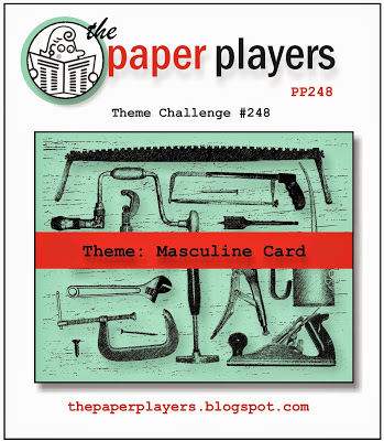
It’s Sunday and that means another fun challenge from The Paper Players! My stint as a guest designer is winding down, only three more after this (sniff), so I’m going to make them count!! This week’s challenge is a fun one, as well as very timely with Father’s Day just around the corner:
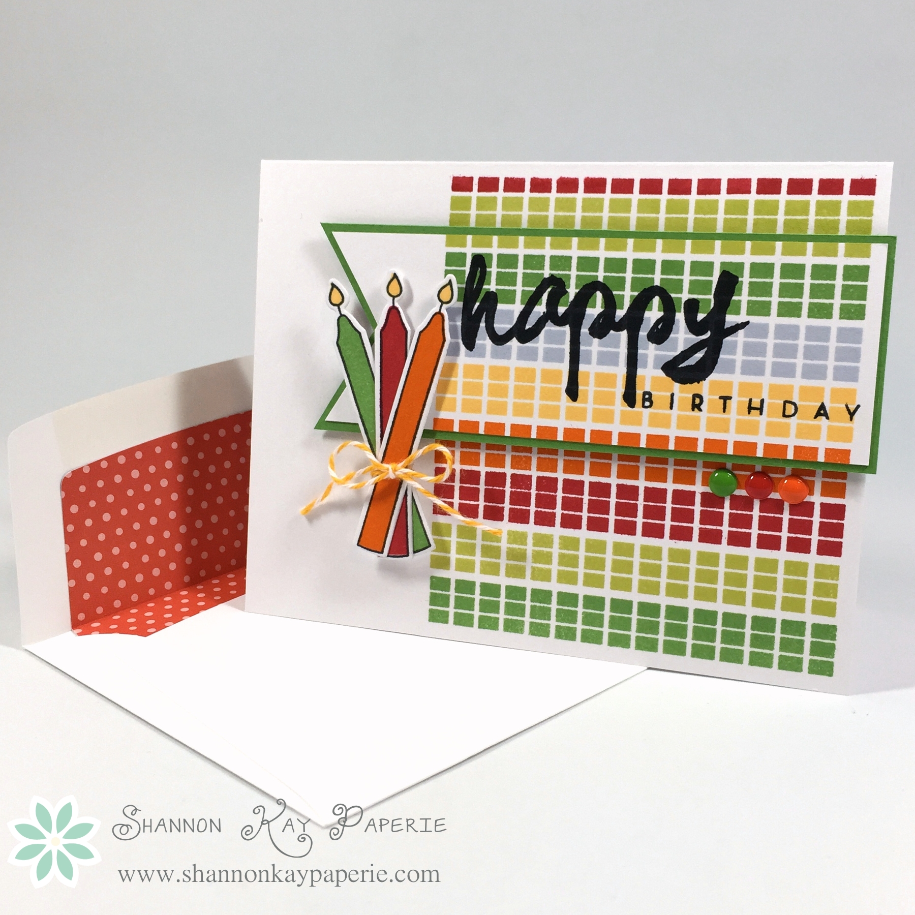
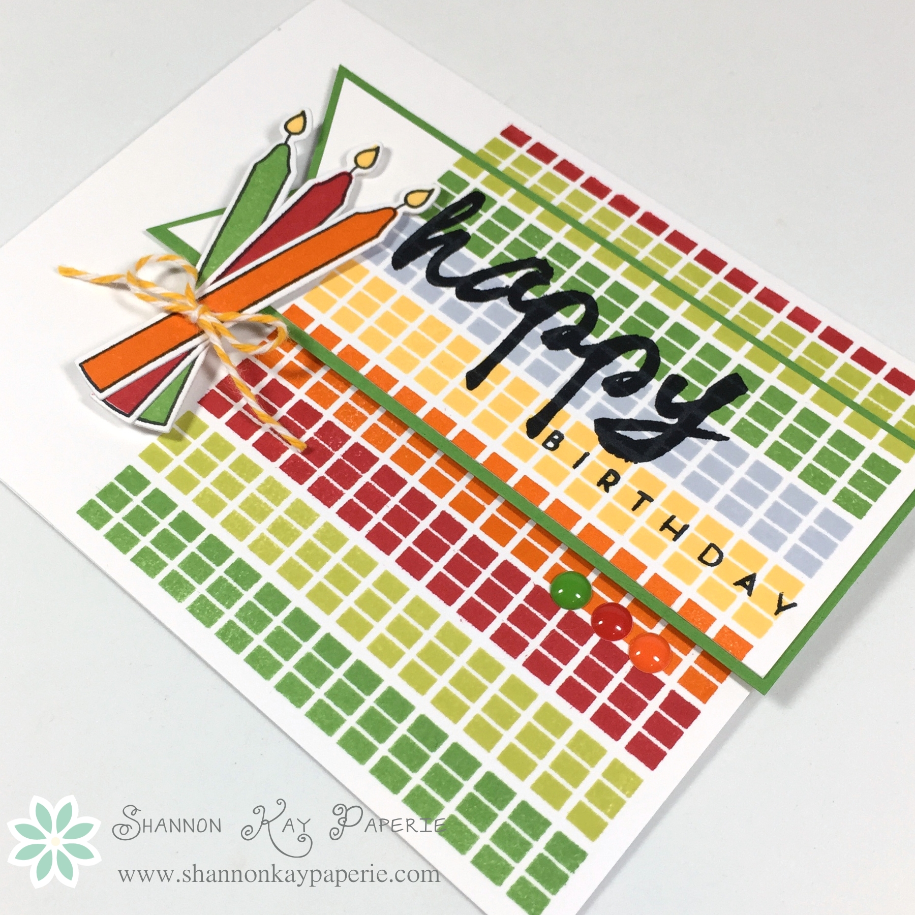
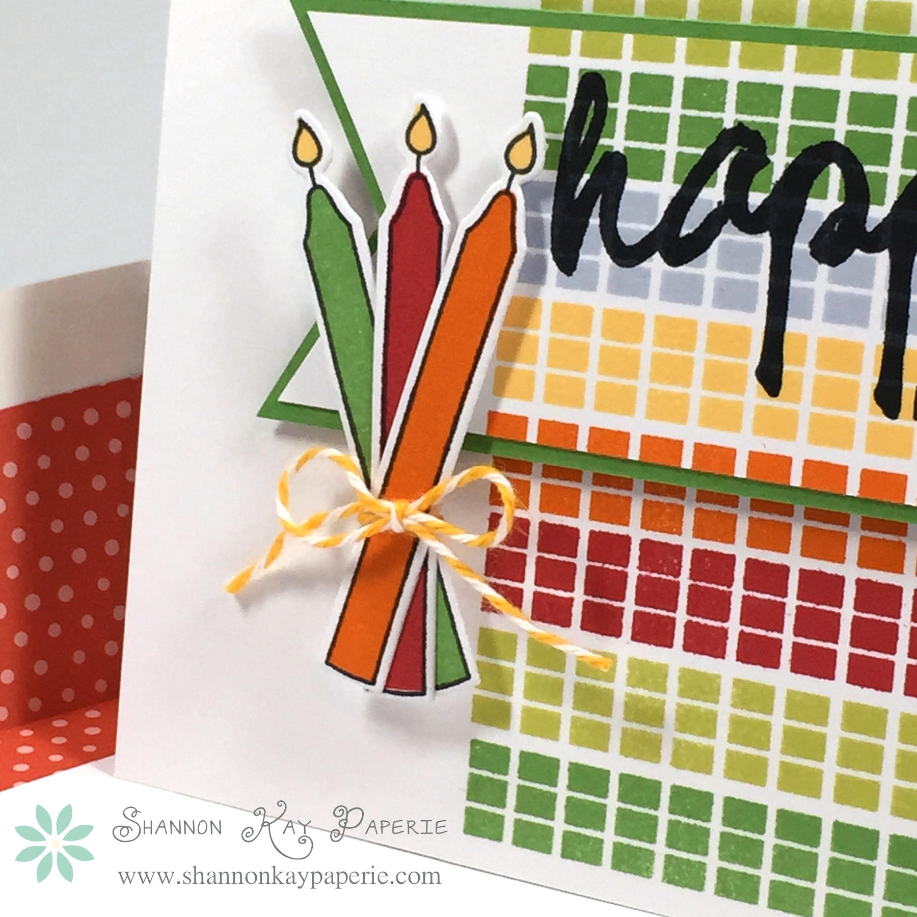
 I found the BEST pack of 6×6 paper while at the Scrapbook Expo and have been itching to use it…it’s perfect for this challenge!! I may have gone overboard on all the patterns, but I couldn’t pick just one or two…
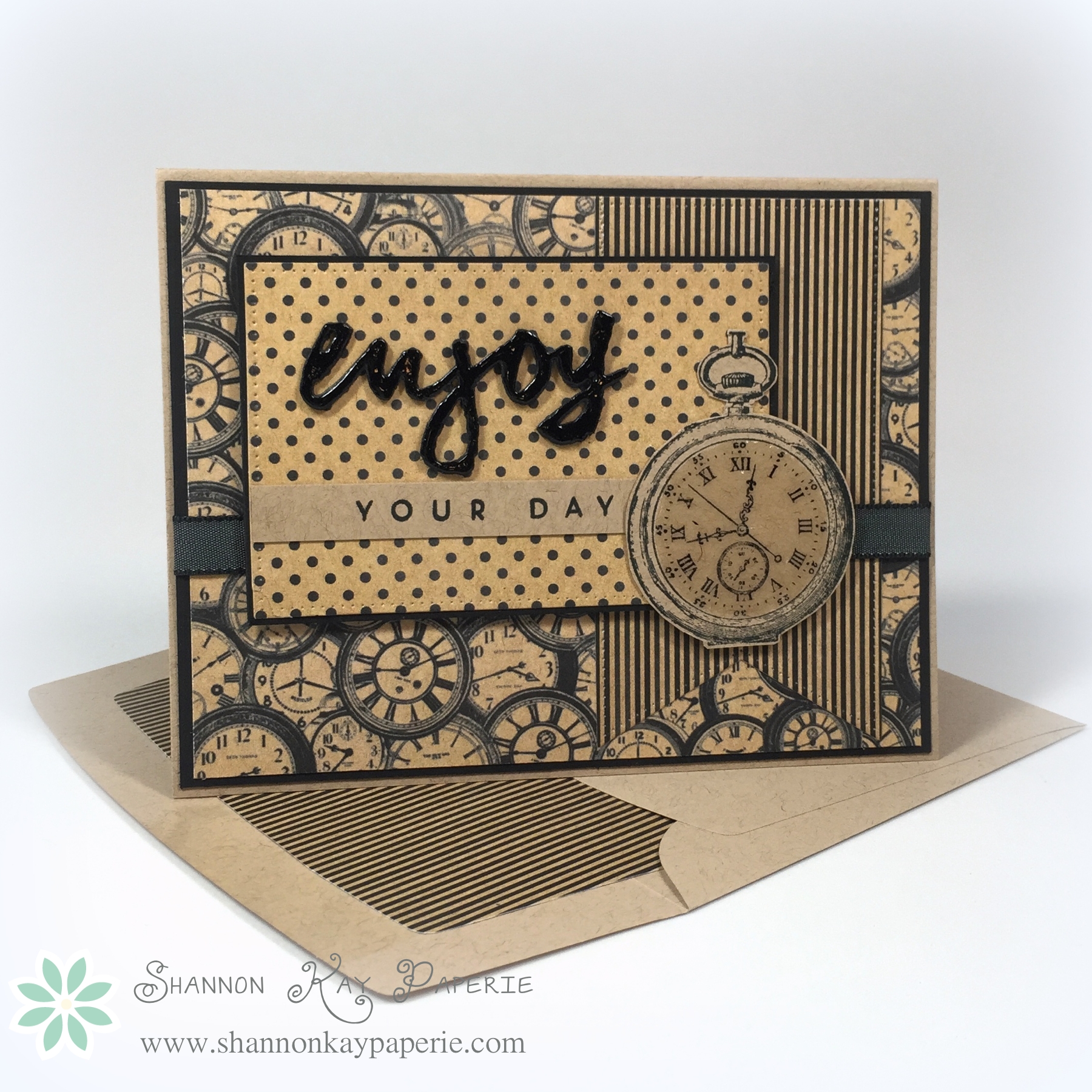 Aren’t they AWESOME!!!??? And I found a stamp set I purchased YEARS ago that had never seen ink (unfortunately), called Watch Set #3 by Rubbernecker Stamps that coordinates perfectly with the background paper!! I stamped and fussy cut one of the watches out and then added Crystal Effects to mimic the glass in the watch face.
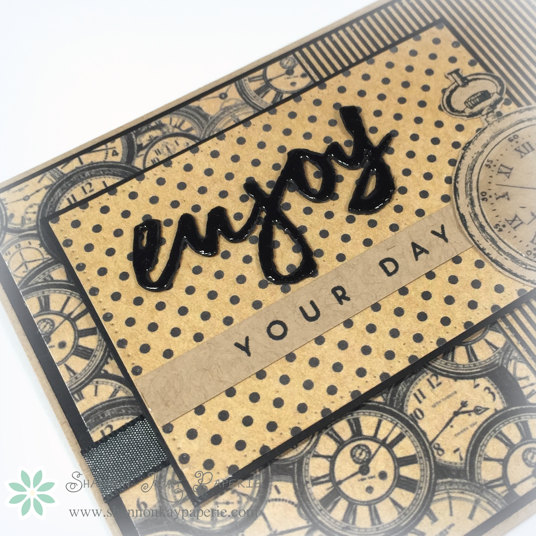
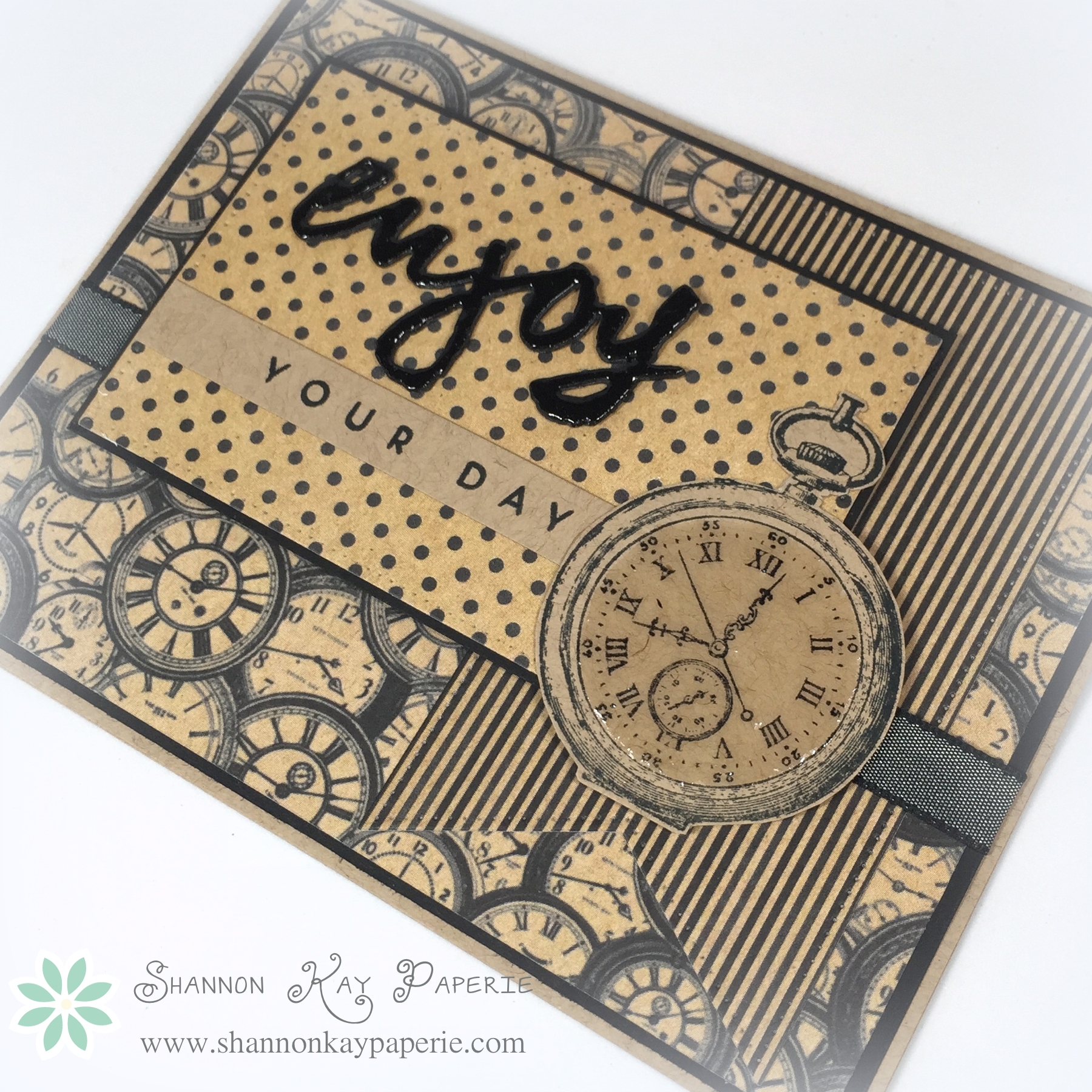 I die cut my sentiment out of black card stock three times and adhered the layers together to give it depth, but it still needed more to pop from all of that busy paper so I added Crystal Effects to it too.
Isn’t it a fun die cut? I love all the coordinating sayings to pair with it. It’s Wet Paint by Papertrey Ink. I purchased it a long time ago, but didn’t realize that it had dies, and then the die set was sold out for forever, but I finally got it!! Yay!
I’m not much on patience so after applying all the Crystal Effects I forced myself to LEAVE the house and run an errand, just to make certain I left it alone long enough to set up! lol
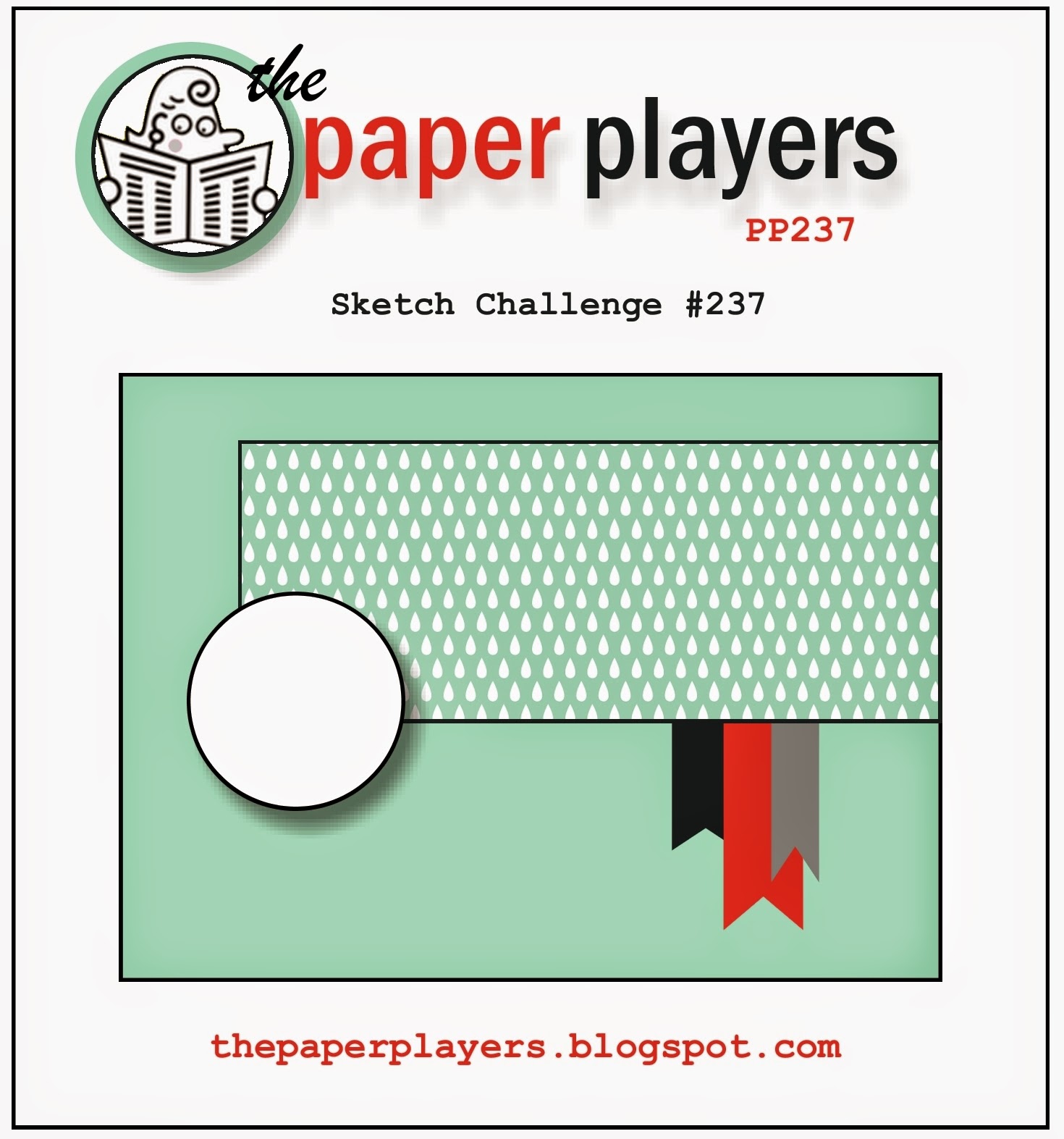
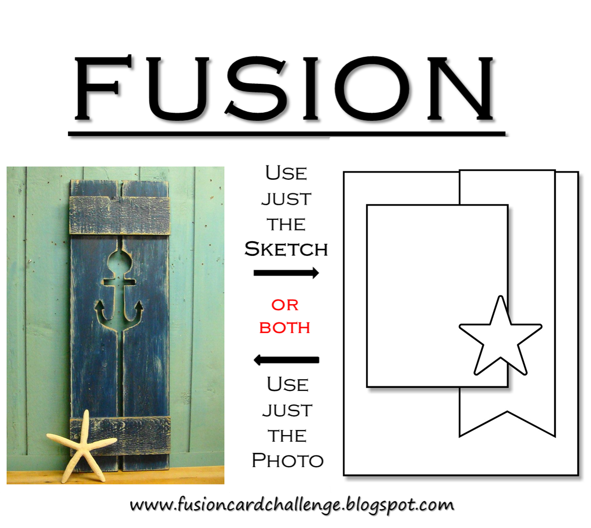
 I need to give thanks to the design team over at the Fusion Card Challenge for the awesome sketch inspiration:
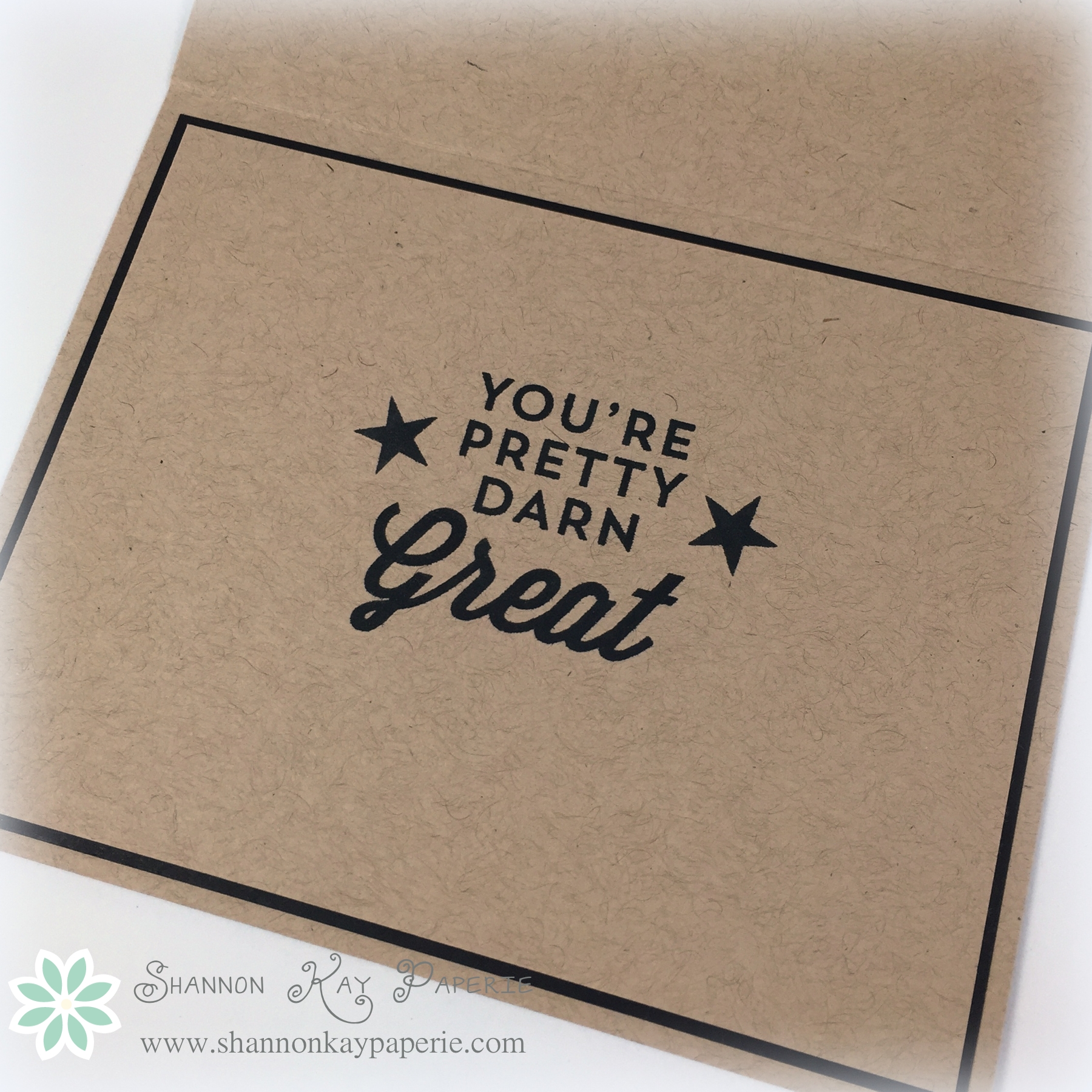
And a quick shot of the inside of the card:
 I hope to see you playing along with us this week; before you start getting inky, please check out the awesome projects from the rest of the design team! There’s something for everyone!
The Paper Players Design Team
Wishing you joy and blessings!
Products Used:
Cardstock: Classic Kraft and True Black by Papertrey Ink
Pattern Paper: Accomplished by Authentique
Ink: Memento Tuxedo Black
Stamps: Wet Paint by Papertrey Ink and Watch Set #3 by Rubbernecker Stamps
Dies: Wet Paint by Papertrey Ink; Fishtail Flags: Pierced and Pierced Rectangle STAX by MFT Stamps; Envelope Liner Die by Stampin’ Up!
Tools: MISTI by My Sweet Petunia
Embellishments: Crystal Effects by Stampin’ Up!