Stampin’ Up!’s Oh-So-Elegant Touches of Texture

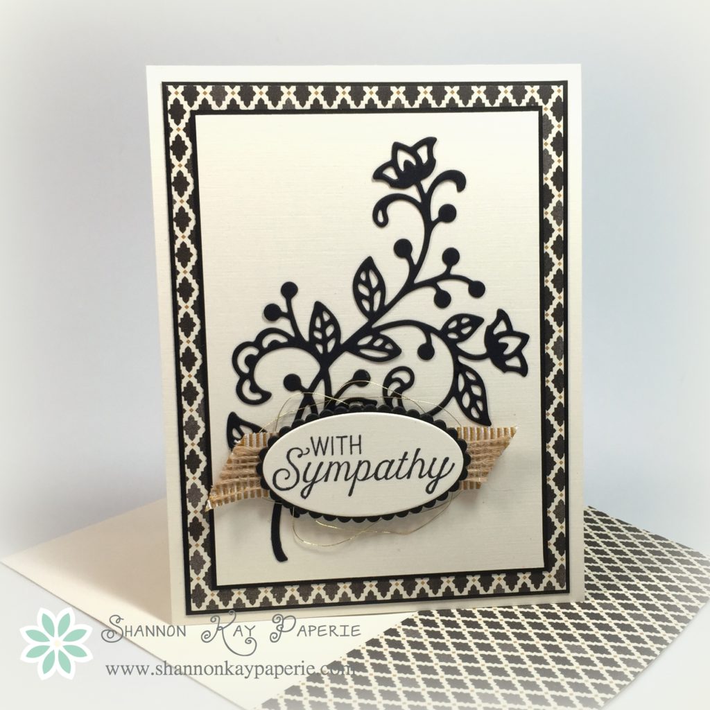
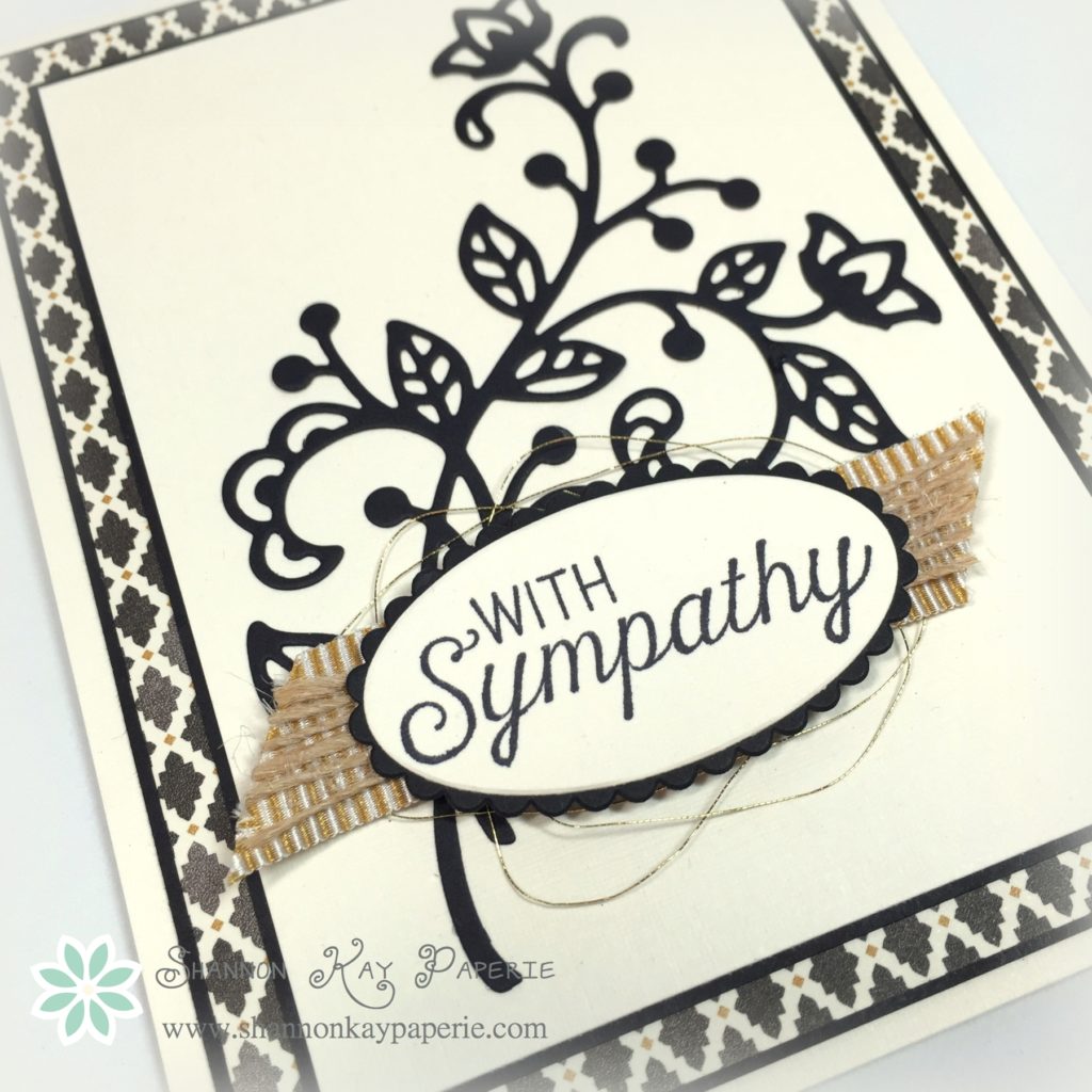
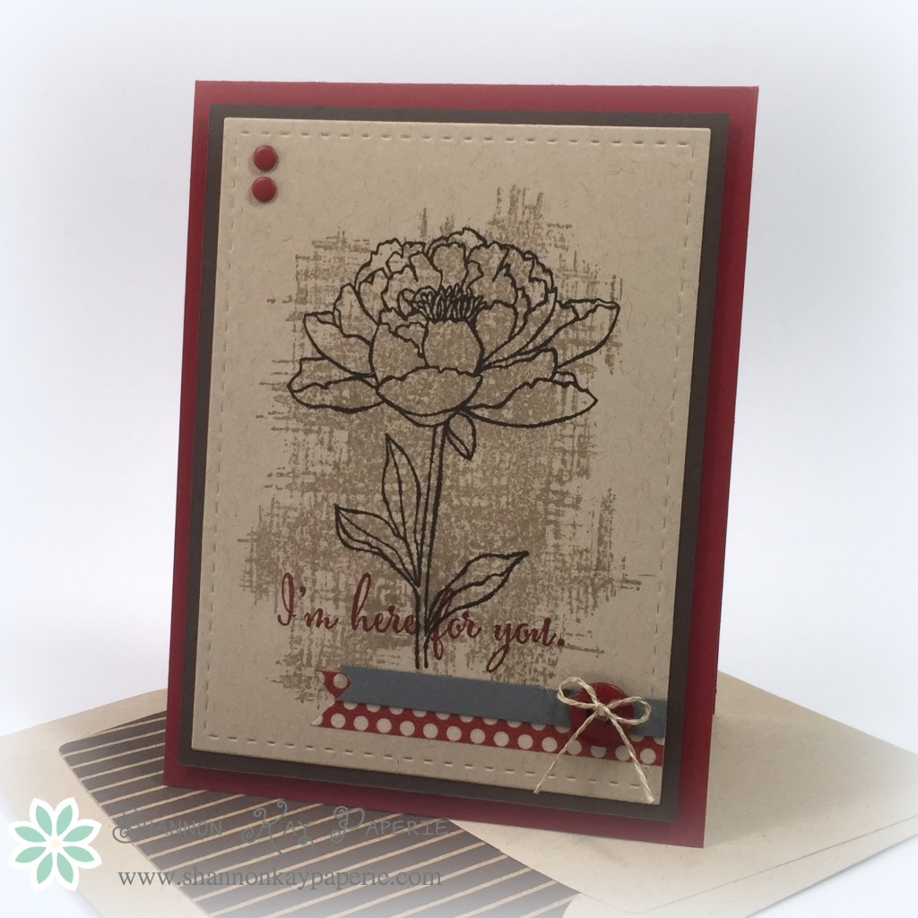
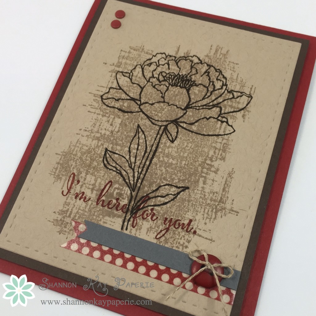
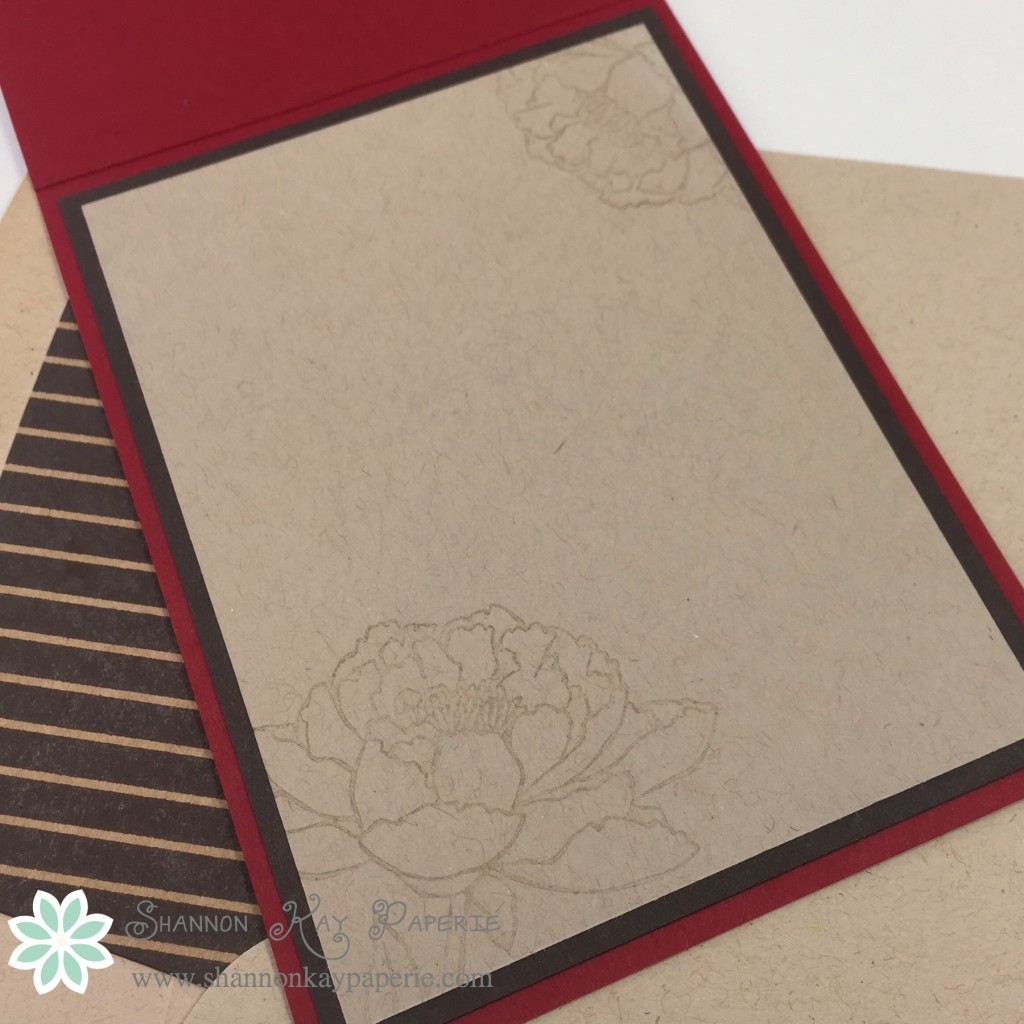
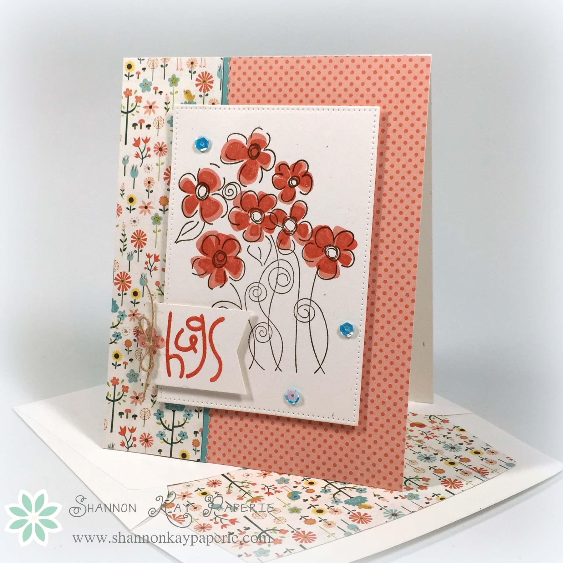
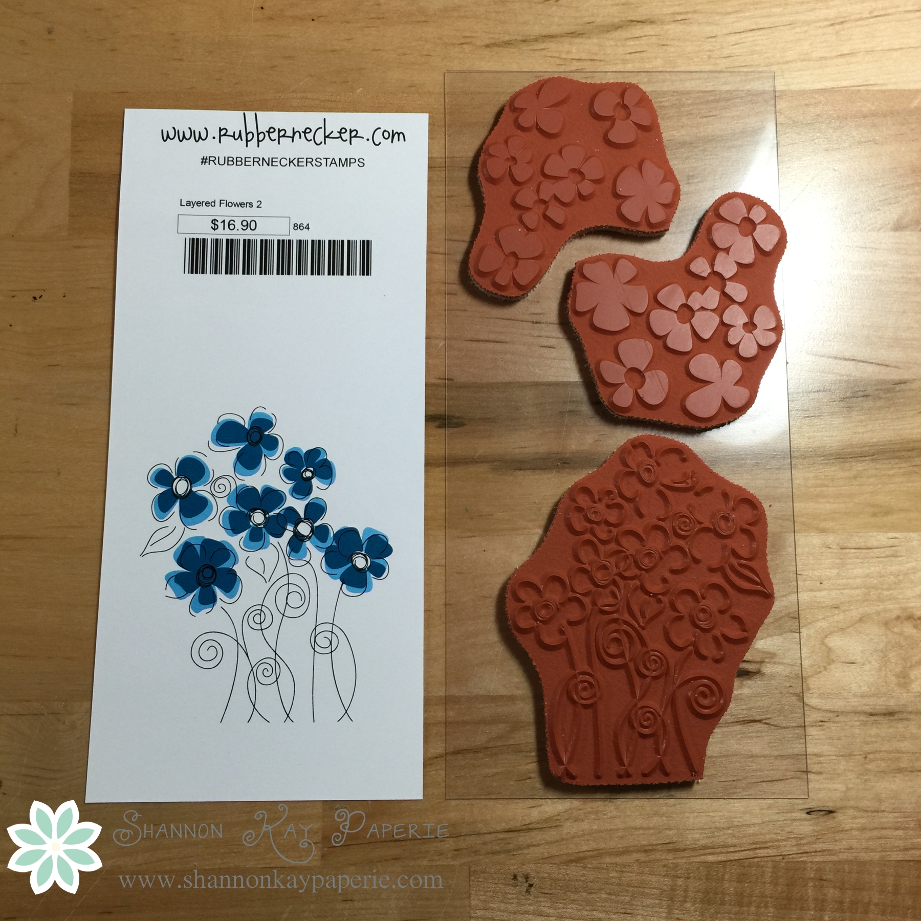
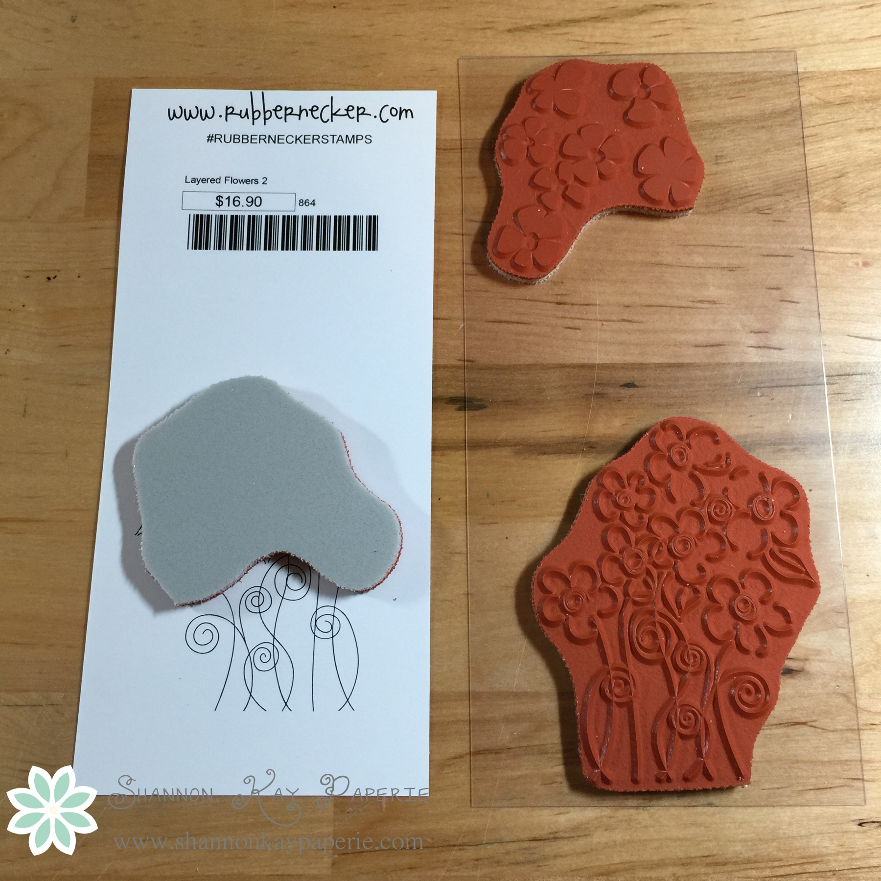
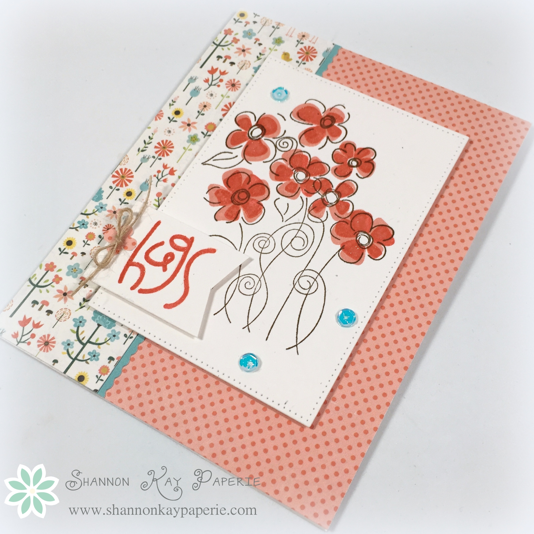
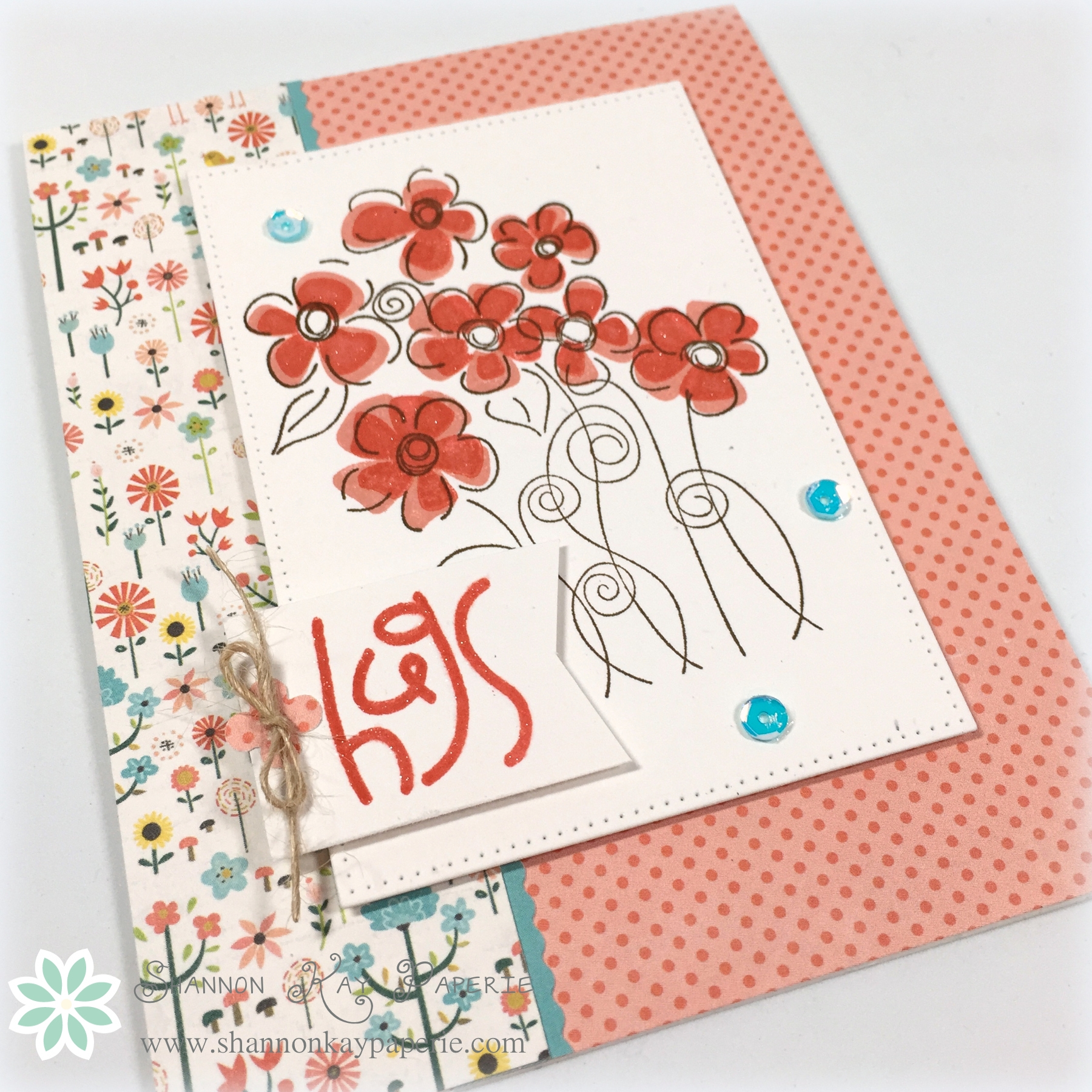
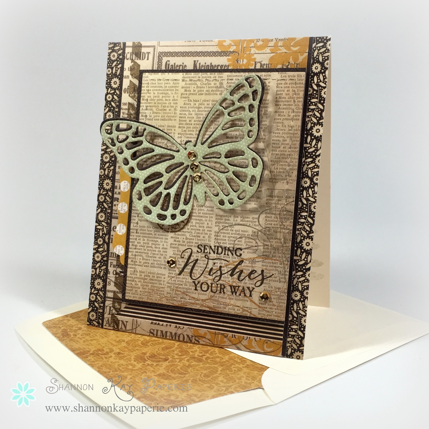
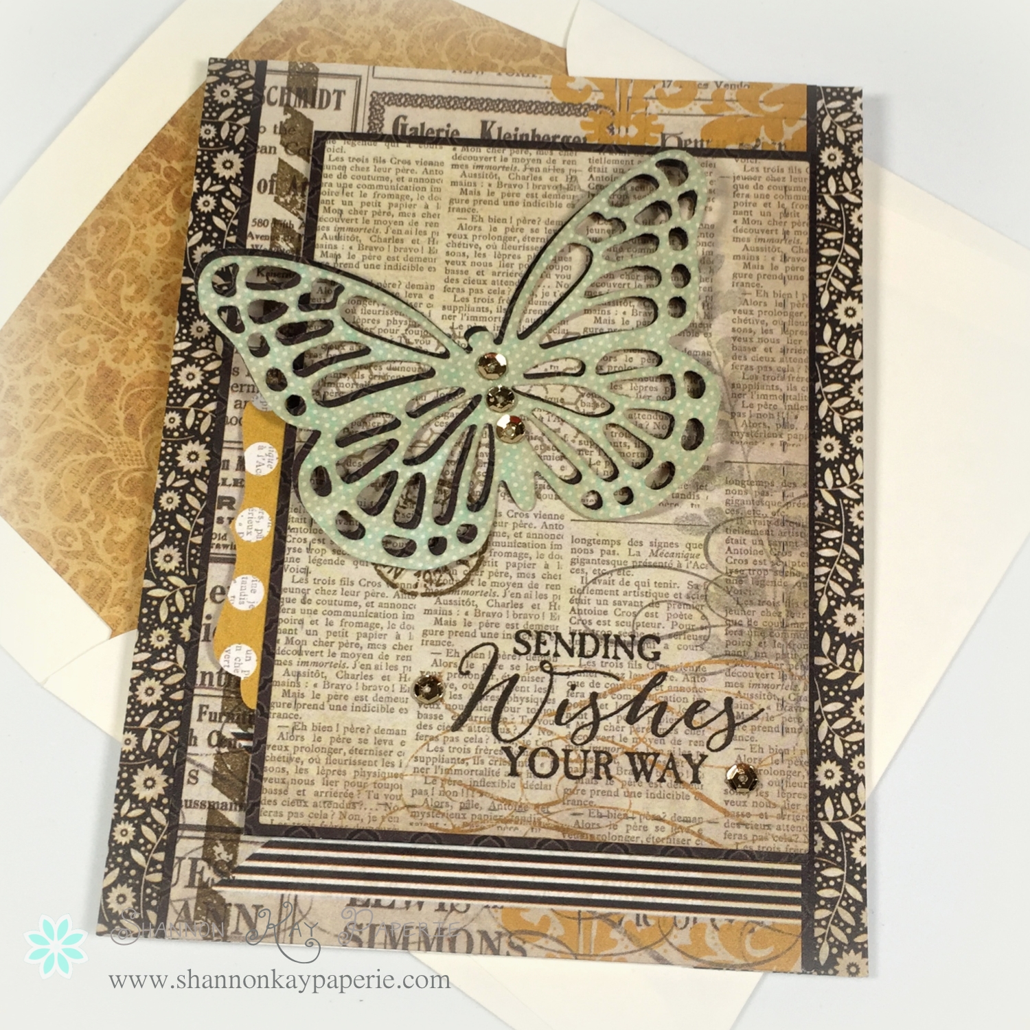
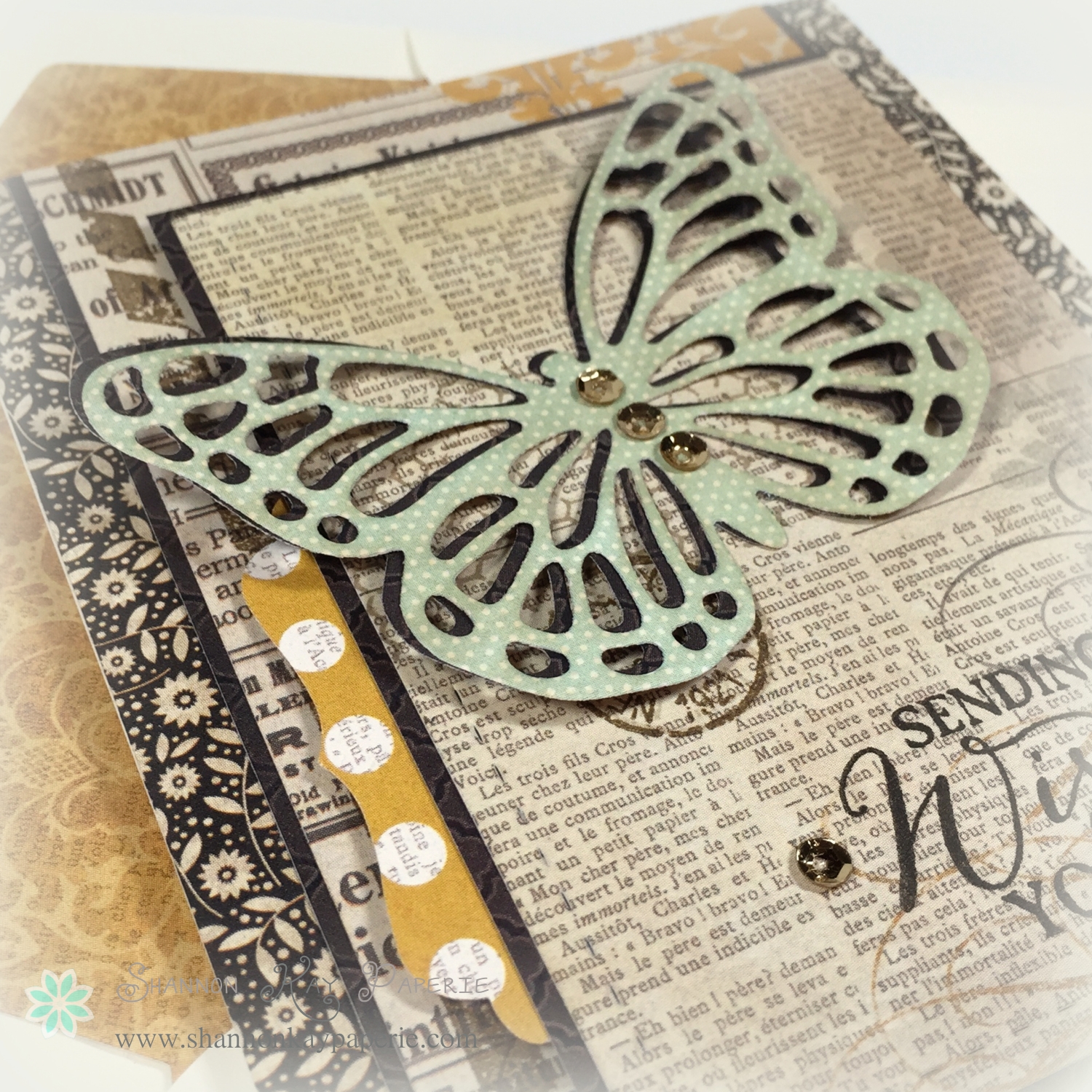
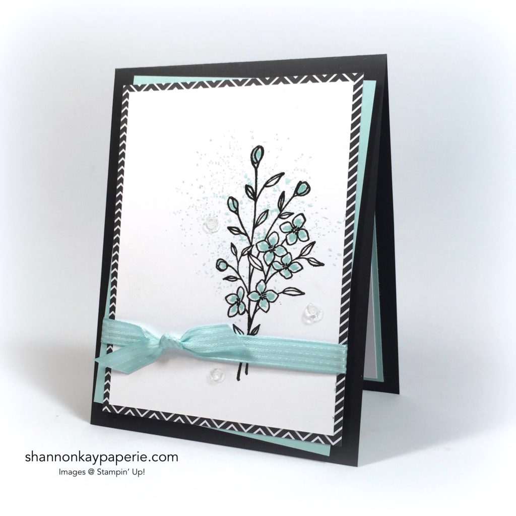
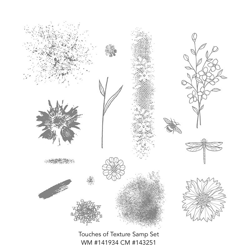
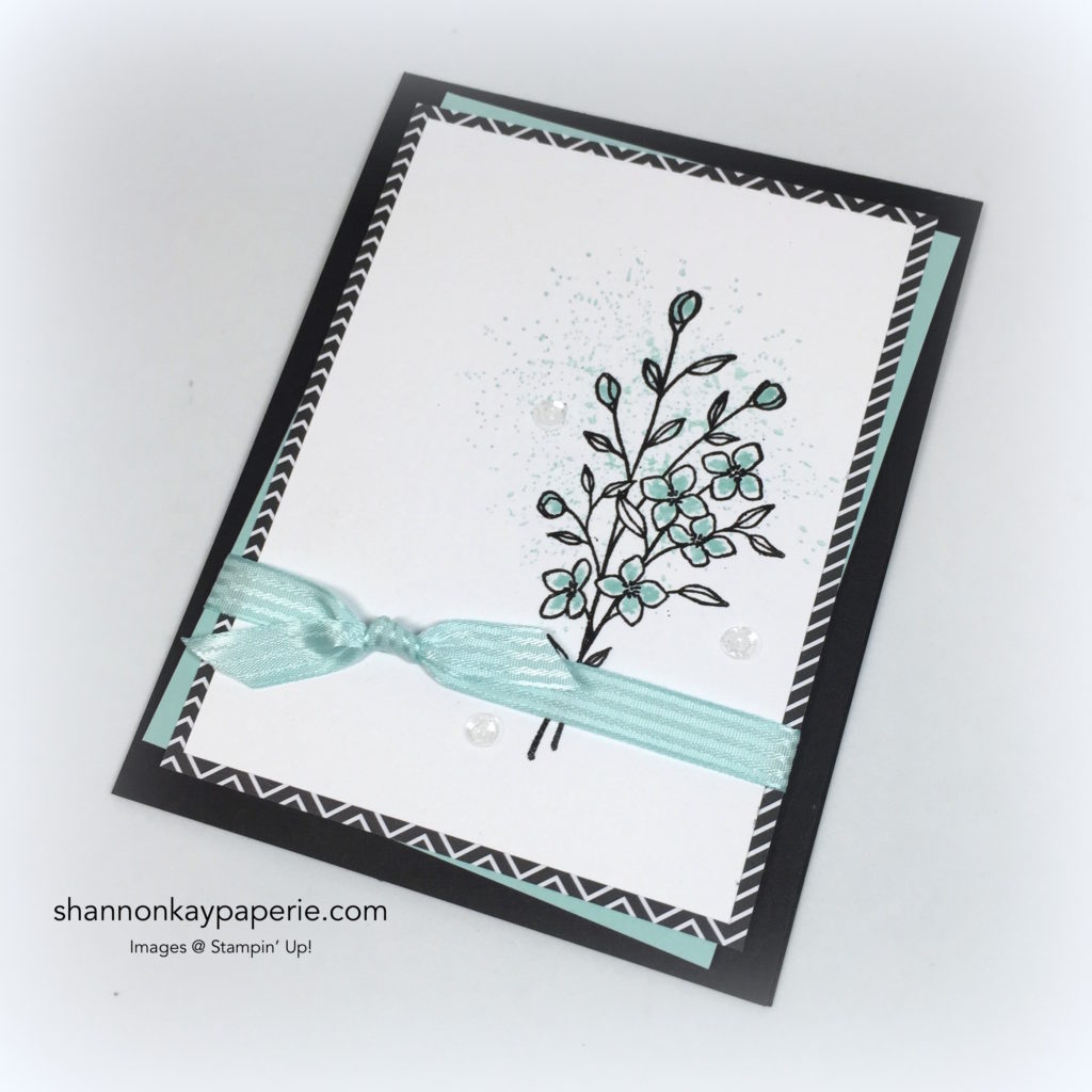
I’m in LOVE with this simple bouquet of flowers!! They were created quickly and easily using Black Embossing Powder and the Touches of Texture Stamp Set.

143251G

The images in this set are so soft and romantic – I can envison SO many possibilities!
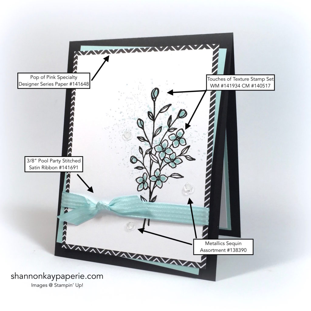
Stampin' Up!'s Oh-So-Elegant Touches of Texture

Tips & Tricks:

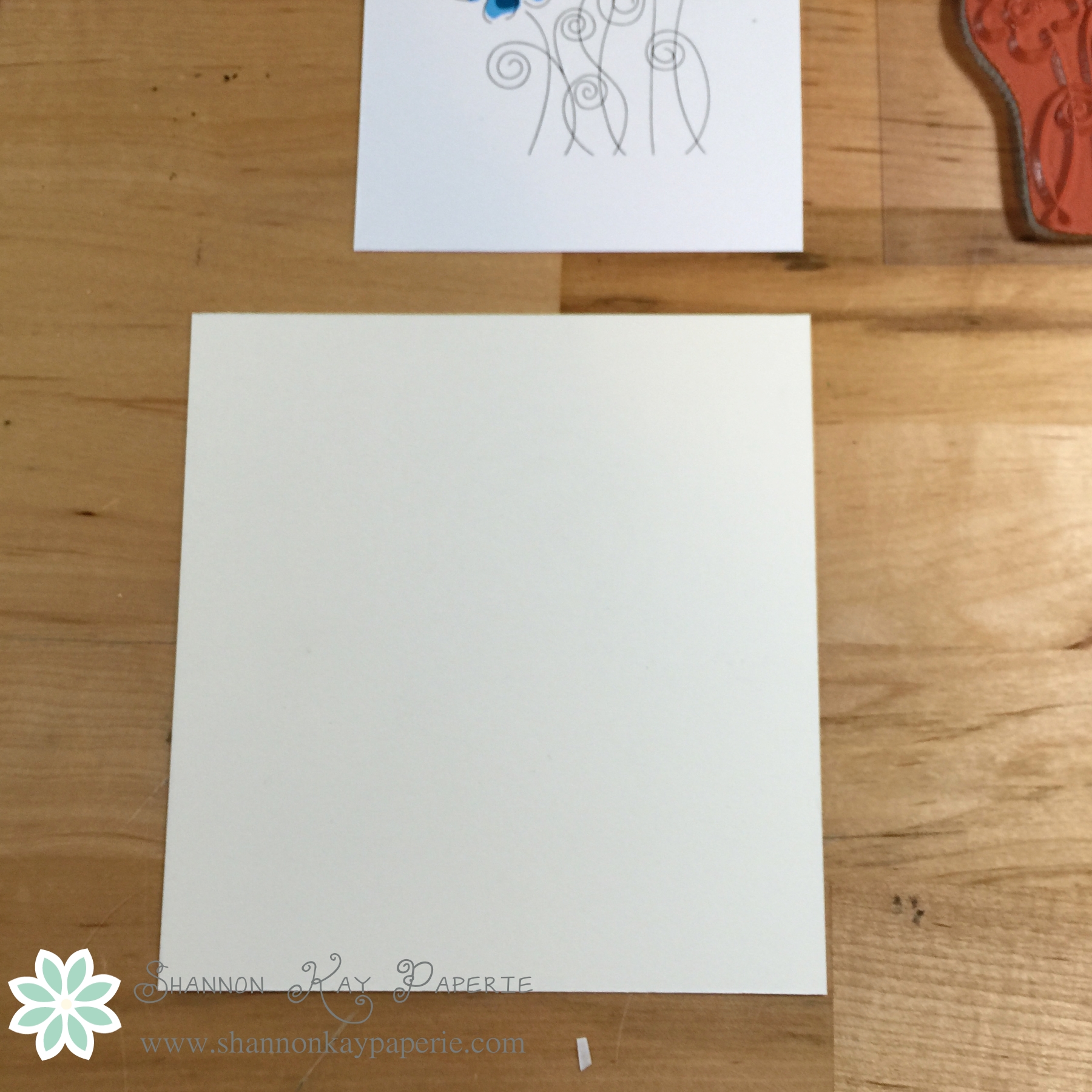
  • Love the stamps but don’t love to color? Versamark Ink, Black Embossing Powder and a Heat Tool to the rescue for quick, clean and sharp images!
  • Neutral backgrounds allow the colors and images shine! The graphic pattern in the Pop of Pink Specialty Designer Series paper contrasts well with the soft image.
  • Coordinating products make designing easy! This 3/8″ Stitched Satin Ribbon in Pool Party matches the card stock and ink perfectly and provides a great “WOW” factor!

Stampin' Up!'s Oh-So-Elegant Touches of Texture

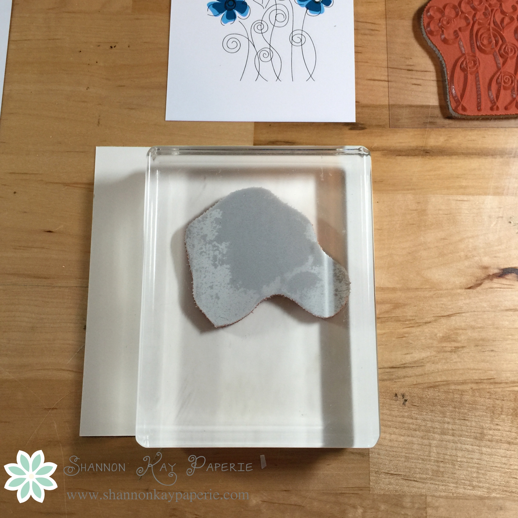
  • In the “olden” days, the only way to achieve the soft background was to flick ink from your marker onto the card stock. It was a very “iffy” process, you never knew quite how it would come out! Now, one background stamp gives the same effect with perfect control! It adds visual weight to the flower image while stamping off once provides a very subtle “splash” of color.
  • Stampin’ Write Markers add beautiful detail within the embossed stamp outline. Wink of Stella provides a pretty sparkle as well, though I did not manage to capture it on film very well this time…it is beautiful in person!
  • Sequins are my go to bling factor. They add nice texture and adhere easily with Glue Dots.
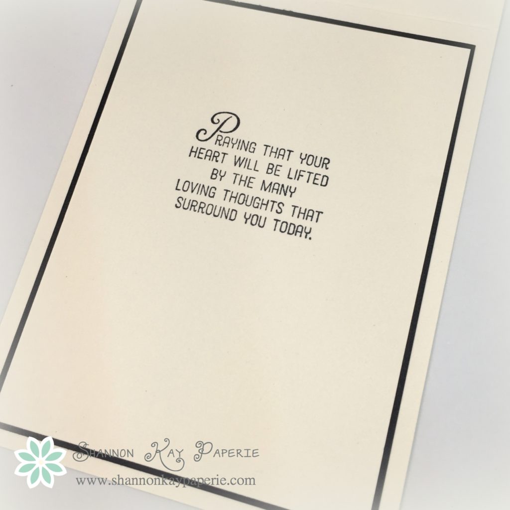
  • I did not add a sentiment to my project today. I think this design would make a great gift set of all-occasion cards. The colors can be changed out so easily!!

Stampin' Up!'s Oh-So-Elegant Touches of Texture

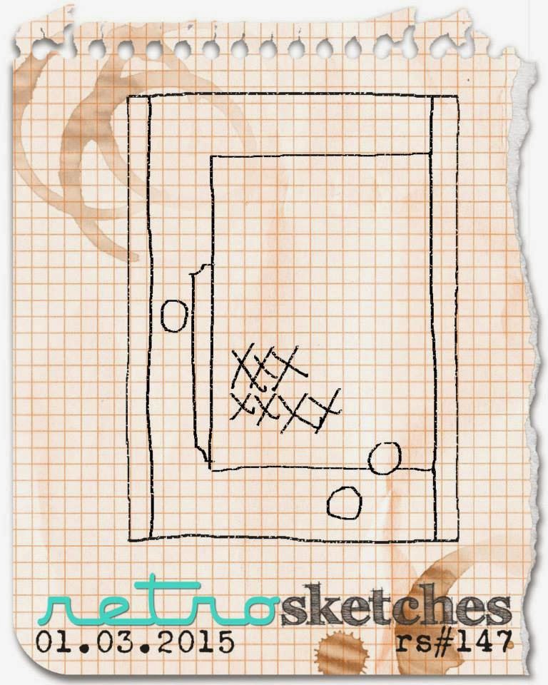
What do you think of my new graphic?!? Do you find it helpful to quickly identify products? I would love to hear your thoughts on the card, the product, the graphic, as well as any other questions or comments you may have!

Thank you for stopping by! I SO appreciate your support!


Sympathy with a Flourish – Freshly Made Sketches 242

Sympathy with a Flourish - Freshly Made Sketches 242

I am practically bursting with excitement to share that the Freshly Made Sketches design team has invited me to be a guest designer for the next few months!!!! Today is my first week with the team and I thoroughly enjoyed working with this sweet sketch from Narelle:

FMS Final 242-001

As I sat down to create my project for this week, I learned of a friends’ loss and knew that I would be making a sympathy card. Not a fun thing to do, but the Moroccan Designer Series Paper provides a beautiful back drop for the amazing flourish die from Flourish Thinlits Die Set.

Sympathy with a Flourish - Freshly Made Sketches 242

The top panel is a cream card stock, backed by a thin panel of Basic Black. Those layers sit on top of a layer of the Moroccan DSP, I love the beautiful pattern in Basic Black, Basic Gray with just a hint of Delightful Dijon. That layer is again backed by a panel of Basic Black and all of them sit on top of a card base of cream card stock. The flourish is  die cut from Basic Black as well. I used the new Layering Ovals Framelits Dies to add the sentiment element to my project. They are A-M-A-Z-I-N-G. A dream to work with and the tiny scallop peeking out is such a lovely detail!!

I added a strip of Delightful Dijon 5/8″ Mini Striped Ribbon as well as a small strip of the new 5/8″ Burlap Ribbon. I couldn’t seem to stop there so I also then added a few swirls of Gold Metallic Thread. The sentiment is attached with Stampin’ Dimensionals.

Sympathy with a Flourish - Freshly Made Sketches 242

A beautiful sentiment from the Flourishing Phrases Stamp Set graces the inside of the card. I’m thrilled with how many inside sentiment options there are in this year’s catalog!

Thank you so much for stopping by! Please be sure to stop by Freshly Made Sketches and check out the inspiration from the rest of the design team!

You’ve Got This – Sunday Stamps 119

Hello there! Today is Sunday and that means another challenge from the Sunday Stamps bi-weekly challenge! This week we have a color combination for you:

You've Got This - Sunday Stamps 119

My first impression of the inspiration photo was Christmas and I thought to myself “That’s got to be a mistake!” I was so caught up with the items in the photo that it took me a few moments to actually see the color banners! My interpretation of the colors was Cherry Cobbler, Early Expresso, Crumb Cake and Basic Gray. I pored through my stamp collection and found just the right thing!

You've Got This - Sunday Stamps 119

I was thrilled to ink up this never-been-used-before stamp set called You’ve Got This by Stampin’ Up! I’m quite pleased with this color combination though it’s a bit outside of my box. This color combination can be used for both men and women and with the sentiment, I think it covers many occasions.

You've Got This - Sunday Stamps 119

I went to grab Crumb Cake card stock and I always check my scrap bag first and found an already die-cut piece ready to go! Cool!

Details:

  • I stamped off once before stamping the background texture stamp in Crumb Cake ink. The flower is stamped in Early Expresso and the sentiment in Cherry Cobbler.
  • I looked through my wash tape collection and found this cute red polka dot wash tape – perfect!
  • A simple hand trimmed banner fulfills the grey aspect of the challenge 🙂
  • One button topped off with a twine bow adds to the rustic feel of the color combination and adds a bit of pizzazz to the design
  • Two Cherry Cobbler candy dots are the perfect accent to balance the layout.
  • Adding to the inside and lining your envelopes is a simple way to add extra love to the project!

You've Got This - Sunday Stamps 119

I’m on a mission to use every stamp in my stash as well as use some of that bling I love to buy but struggle to use! So be prepared to see more ‘stuff’ on my cards! Which do you prefer: clean and simple; a bit of bling; or do you like to add LOTS of bling? I would love to hear from you!

I hope that my project has inspired you to join us in this challenge, for more inspiration please visit these lovely ladies:

Thank you for visiting today!

Products Used:

Cardstock: Cherry Cobbler, Crumb Cake, and Early Expresso by Stampin’ Up!

Pattern Paper: Under the Tree Designer Series Paper (retired) by Stampin’ Up!

Ink: Cherry Cobbler, Crumb Cake, and Early Expresso by Stampin’ Up!

Stamps:  You’ve Got This by by Stampin’ Up!

Dies: Envelope Liner Die by Stampin’ Up!

Tools:  MISTI

Embellishments: Cherry Cobbler Candy Dots and Washi Tape (retired) by Stampin’ Up!; Natural Twine by May Arts; Button by Making Memories (from my stash)

Spring Flowers – The Challenge #29

SKP Watermarked Photos3-051

Good Morning and Happy Hump Day to you!! Midway through the week, I hope yours is going well!! I’m a happy camper because I was able to stamp again last night. Woohoo!

Last week I promised another card using Rubbernecker Stamps and a technique that the owner/designer demonstrated for easy stamp alignment and the sketch this week over at The Challenge provided the perfect backdrop for my stamp!

New Banner-002

The stamp I chose for today’ project is the Layered Flower 2 stamp by Rubbernecker Stamps. It’s a three step stamp, and here’s how the owner demonstrated lining all three stamps up without the use of any extra tools:

Here’s what the stamp set looks like straight out of the package:

SKP Watermarked Photos3-046

The image on the packaging is a life size image of the stamp, so take the flower stamp with the larger petals and place it over the flower image on the packaging, like so:

SKP Watermarked Photos3-047

Then take your clear block and place it over the stamp, being careful to line the right and bottom edges up with the packaging, like so:

SKP Watermarked Photos3-048

Then, layout the panel you want to stamp on:

SKP Watermarked Photos3-049

Then, ink your stamp up with the lighter petal ink and stamp on your panel, being careful to once again line the clear block up with the right and bottom edges of your panel. Repeat this process with the smaller flower stamp and then finally with the outline stamp, and you will wind up with a wonderfully aligned image!

SKP Watermarked Photos3-050

And as I was reminded, the image is designed to NOT be perfect so don’t stress over it too much!

SKP Watermarked Photos3-053

I had a bit of fun with this stamp and some new papers. I wanted the flowers to really pop so I stamped the lighter image in Melon Berry ink by PTI and then the darker image in Calypso Coral ink by Stampin’ Up!. I used a fun sentiment in a new to me set called Sentiment Sampler by Paper Smooches. I think the sweet font of the sentiment goes well with the sweet paper.

SKP Watermarked Photos3-054

I received happy mail yesterday from Winnie & Walter and was so surprised when I found the stamps wrapped up with twine, a nice note, and a little bag of free sequins…how sweet is that! I posted a picture of it over on my Instagram account if you would like to see it. Even sweeter was the fact that some of the sequins were the perfect blue to add a bit of pizzazz to my card!

A generous coating of Wink of Stella was applied to the Calypso Coral part of the flowers as well as to the sentiment, they shimmer so prettily in person!

I thought the sentiment tag needed a little something so I fussed a bit with that, deciding finally on a tiny punched flower and a little bow tied with twine. Please let me know what you think, the jury’s still out on whether or not to leave the extra bits:)

In addition to playing along with The Challenge, I am also playing along with Just Us Girls, their challenge this week is Spring, as well as the Simon Says Stamp Wednesday Challenge which is Spring Flowers:

Screen Shot 2015-03-12 at 7_32_13 PM

wednesdayblog-logo

Thank you so much for stopping by! I appreciate your visit and love hearing from you!!

Wishing you joy and blessings!

Products Used:

Cardstock: Rustic Cream by Papertrey Ink

Pattern Paper: Simple Life by Echo Park

Ink: Melon Berry by Papertrey Ink; Calypso Coral and Soft Suede by Stampin’ Up!

Stamps:  Layered Flower 2 by Rubbernecker Stamps and Sentiment Sampler by Paper Smooches

Dies: Pierced Retangle STAX Dies by MFT Stamps and Envelope Liner Die by Stampin’ Up!

Tools:  MISTI by My Sweet Petunia (for the sentiment)

Embellishments: Sequins by Winnie & Walter


Butterfly Wishes…

Watermarked Blog Posts_2-033

I know, I know…this is a huge departure from my usual style…please tell me you like it!

It all started with this sketch from Retro Sketches:

rs147

So I then sat down at my paper bin and started going through it, pulling out this, and then that, then another…this is my favorite part of designing, just letting it flow and going with it. I came across this 6×6 pad from My Mind’s Eye called Lost and Found: Sunshine and just fell in love with all the beautiful patterns and colors.

Watermarked Blog Posts_2-034

Next came stamps. I still had my order from Stampin’ Up! scattered all over my work top so I browsed them and found this totally amazing and awesome stamp set called Butterfly Basics. In my humble opinion, whoever designed this stamp set should be given a raise and a corner office so they can make lots more in this style!

I chose a pattern paper to stamp over because I wanted to keep with that aged, vintage-y feel. I stamped in Crumb Cake, Sahara Sand, and Soft Suede with the sentiment stamped in Early Expresso. I tried it first in Tuxedo Black but it was toooo harsh.

Watermarked Blog Posts_2-036

Next came le papillon, or the butterfly (sorry I was feeling French!) die. Isn’t this die A-M-A-Z-I-N-G?? I know, right?!? Love. I have seen some pointers out there in cyber space to use a dryer sheet to help ease the die out of the metal, so I tried it and loved it! The layer goes: cutting pad, paper, dryer sheet, wax paper, die, cutting pad. I cut two dies and then layered them to give a shadow and help my blue butterfly stand out. I loved the blue paper and the contrast it provided with the others colors on the card, but felt it was just a bit harsh. So I pulled out my Tim Holtz Antique Linen Distress Ink and distressed the butterfly a bit. Then of course I had to add some to the rest of the card…

All of the paper you see, except for the card base, is pattern paper. I hope you don’t think it’s too much, I couldn’t seem to stop layering!! Please, please, stop and let me know if you like it! I’m nervous about stepping outside of my box, lol!

Thank you so much for stopping by and if you would like to have more information regarding any of these Stampin’ Up! products, please visit Stampin’ Pretty. Mary Fish is my upline, a hugely successful demonstrator, and a very kind and talented lady! I know she would be happy to answer any questions and help you order.

Wishing you joy and blessings!

Watermarked Blog Posts_2-035

Products Used:

Cardstock: Vintage Cream by Papertrey

Pattern Paper: Lost and Found: Sunshine by My Mind’s Eye

Ink: Soft Suede, Early Expresso, Crumb Cake, and Sahara Sand by Stampin’ Up!

Stamps:  Butterfly Basics by Stampin’ Up!

Dies: Butterfly Thinlits Dies and Envelope Liner Die by Stampin’ Up!

Tools:  MISTI by My Sweet Petunia

Embellishments: generic gold sequins